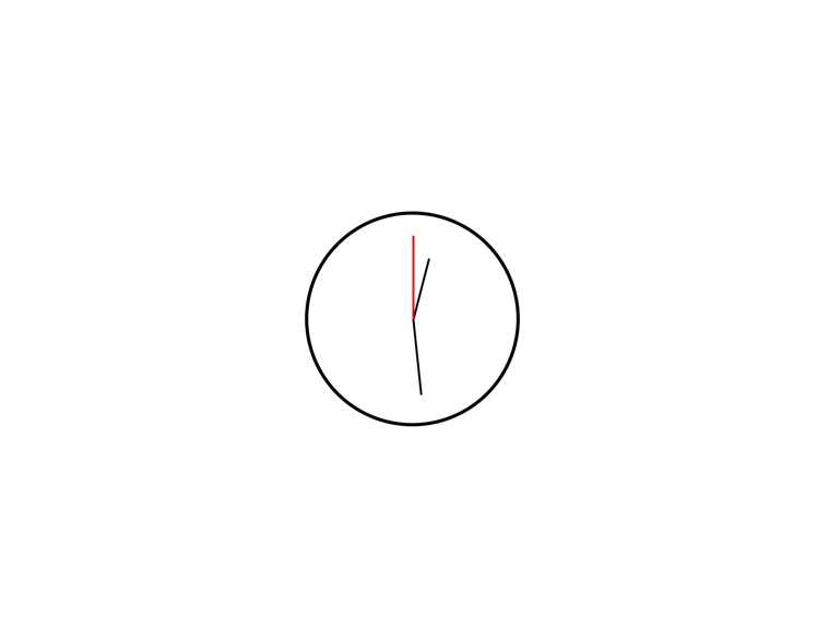
처음 아날로그 시계를 만들기 시작할 때에는 그동안 다중 타이머를 만들었던 것과 날짜 계산기를 만들었던 것을 생각하며 쉽겠지 하며 시작했는데 사실 쉬웠다 ㅋ
아 문자열 포매팅 방법을 몰라 애를 먹었던 기억이 있지만, js에서는 포매팅을 할 때 `${변수명}`을 쓴다는 걸 알았다. 아 그리고 바늘이 회전할 때 transform - origin을 이용해서 회전축을 설정했다.
내가 만들었던 아날로그 시계의 알고리즘은 아래와 같다.
- 현재 시간을 변수에 담아 현재 시, 분, 초를 추출
- html로 만들었던 바늘도 js에서 변수로 지정
- 시계는 60조각으로 나누어져 있기 때문에 1분에 6도라는 결과가 나옴
- 따라서 분, 초침은 * 6을 해서 각도를 지정
- 시침은 24시간이 아닌 12시간으로 나누어져 있기 때문에 if문으로 오전과 오후를 나누어 각도 설정
헷갈리는 부분은 코드에 주석을 보며 이해하면 쉬울 것 같다.
<!DOCTYPE html>
<html>
<head>
  <title>clock</title>
  <link rel="stylesheet" href="css.css">
</head>
<body>
  <div class="clock">
    <div id="center"></div>
    <div id="hour"></div>
    <div id="min"></div>
    <div id="sec">
  </div>

  <script>
    setInterval(() =>{
    // 현재 날짜 time에 할당
    const time =  new Date()

    // time에서 시간만 추출 (시, 분, 초)
    const hour = time.getHours();     //0~23
    const min = time.getMinutes();      //0~59
    const sec = time.getSeconds();      //0~59

    // 화면상의 객체 선택
    const hh = document.getElementById('hour')
    const mm = document.getElementById('min')
    const ss = document.getElementById('sec')

    // 각도 선택
    if (hour >= 12){
      const DegHour = (hour - 12) * 30 + min * (360 / 12 / 60) // 분을 고려해서 시침이 한번에 움직이지 않게 하기 위함
      const DegMin = min * 6
      const DegSec = sec * 6

      hh.style.transform = `rotate(${DegHour}deg)`;
      mm.style.transform = `rotate(${DegMin}deg)`;
      ss.style.transform = `rotate(${DegSec}deg)`;

    }
    else{
      const DegHour = (hour - 12) * 30 + min * (360 / 12 / 60)    // 0.5를 곱해 60분기준 30도를 추가 ex) 30분이라면 15도의 각도 추가
      const DegMin = min * 6
      const DegSec = sec * 6

      hh.style.transform = `rotate(${DegHour}deg)`;
      mm.style.transform = `rotate(${DegMin}deg)`;
      ss.style.transform = `rotate(${DegSec}deg)`;
    }
  },1000)

  </script>
</body>
</html>
css
body {
  margin: 0;
  display: flex;
  justify-content: center;
  align-items: center;
  min-height: 100vh;
}

.clock {
  position: relative;
  height: 500px;
  width: 500px;
  border-radius: 50%;
  border: 8px solid;
}

#center{
  position: absolute;
  left: 250px;
  top: 250px;
  width: 1px;
  height: 1px;
  border: solid 2px;
  border-radius: 50%;
  z-index: 2;
}

#hour {
  position: absolute;
  top: 100px;
  left: 250px;
  width: 3px;
  height: 150px;
  border: 1px solid;
  border-radius: 3px;
  background-color: black;
  transform-origin: bottom;
}


#min {
  position: absolute;
  top: 70px;
  left: 250px;
  width: 3px;
  height: 180px;
  border: 1px solid;
  border-radius: 3px;
  background-color: black;
  transform-origin: bottom;
}

#sec {
  position: absolute;
  top: 50px;
  left: 250px;
  width: 3px;
  height: 200px;
  border: 1px solid red;
  border-radius: 3px;
  background-color: red;
  transform-origin: bottom;
}
미리보기
반응형
'Front end > JavaScript' 카테고리의 다른 글
| Weather site 만들기 (2) | 2023.03.19 |
|---|---|
| (JavaScipt) OpenWeatherAPI 사용법 (0) | 2023.03.17 |
| 카운트다운 계산기(JavaScript) (0) | 2023.03.01 |
| JavaScript를 이용하여 동적 테이블 만들기 (1) (0) | 2023.02.27 |
| 다중 타이머 만들기 (Java Script) (0) | 2023.02.03 |